
Visualizing human emotions on a map and investigating the human relationship with space is a relatively new component in cartography. Simple static thematic maps dealing with this topic have been around for a while. A known example is the “Map of World Happiness” by White (2007). I am not very happy with the cartographic layout however. The colour grey should be included in the legend (representing “no data” I suppose). The color black in the Caspian Sea and other big lakes is irritating.
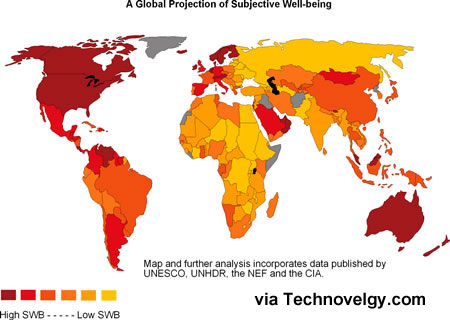
Map of World Happiness
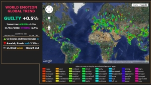
Web scraping and mobile technology have brought new opportunities to dynamically map emotions. The World Emotion Global Trend website by Maurice Benayoun analyzes various live online sources and maps 64 emotions in more than 3000 places around the world.
https://www.youtube.com/watch?v=F-D80BdrSo0
A similar approach is the global Twitter Hearbeat – Tweetbeat – analyzing twitter messages for emotions and creating a heatmap from the data. See below the heatmap during the event of hurricane Sandy:

SGI Global Twitter Heatbeat


")


 nachdenkseiten

